Table of Contents
- Why Your HR Team Needs an Analytics Dashboard
- Step 1: Define Your Dashboard Objectives and Audience
- Step 2: Identify and Prioritize Key HR Metrics
- Step 3: Assess and Prepare Your Data Sources
- Step 4: Select the Right Dashboard Tool
- Step 5: Design Your Dashboard Layout and Visualizations
- Step 6: Build and Test Your Dashboard
- Step 7: Implement Access Controls and Security
- Step 8: Train Users and Drive Adoption
- Step 9: Monitor, Iterate, and Improve
- Common Pitfalls to Avoid
- Measuring Dashboard Success
- Frequently Asked Questions
Building an effective HR analytics dashboard is one of the most powerful ways people teams can transform raw workforce data into actionable insights. When you build an HR analytics dashboard that clearly visualizes key metrics, you empower leaders to make data-driven decisions about talent acquisition, retention, development, and organizational performance. This comprehensive guide walks you through every step of creating a dashboard that delivers real value to your organization.
Why Your HR Team Needs an Analytics Dashboard
HR analytics dashboards serve as the central nervous system for people operations, consolidating disparate data sources into a single, accessible view. Unlike static reports that quickly become outdated, dashboards provide real-time or near-real-time visibility into workforce trends and patterns. They enable HR professionals to spot issues before they escalate, identify opportunities for improvement, and demonstrate the strategic value of people initiatives with concrete data.
Organizations with effective HR dashboards report faster decision-making cycles, improved workforce planning accuracy, and better alignment between HR initiatives and business objectives. The visual nature of dashboards makes complex data accessible to stakeholders across all levels of technical expertise, from executives who need high-level trends to HR business partners who require detailed operational metrics.
Step 1: Define Your Dashboard Objectives and Audience
Before selecting tools or metrics, clarify exactly what your dashboard needs to accomplish and who will use it. Different stakeholders have different information needs. Executives typically want high-level strategic metrics that tie to business outcomes, while HR managers need operational details to manage day-to-day activities. Recruiting teams focus on pipeline and hiring metrics, while learning and development teams track training completion and skill development.
Start by conducting stakeholder interviews to understand their most pressing questions and decisions. What keeps them up at night? What information would help them do their jobs more effectively? Document these requirements clearly, prioritizing the most critical use cases. This foundation ensures your dashboard delivers actual value rather than becoming another unused report.
Step 2: Identify and Prioritize Key HR Metrics
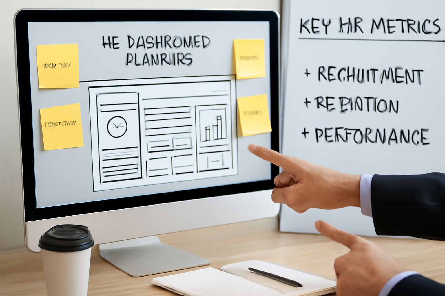
With objectives defined, select the specific metrics your dashboard will track. Effective HR dashboards typically organize metrics into several categories:
Workforce Composition Metrics
Track headcount by department, location, employment type, and demographic characteristics. Include workforce diversity metrics, span of control ratios, and organizational structure visualizations. These foundational metrics provide context for all other analyses and support strategic workforce planning.
Talent Acquisition Metrics
Monitor time-to-hire, cost-per-hire, source of hire effectiveness, offer acceptance rates, and candidate pipeline health. Quality of hire metrics, though more complex to calculate, provide crucial insights into recruiting effectiveness. Track these metrics by department, role level, and other relevant segments.
Retention and Turnover Metrics
Calculate overall turnover rate, voluntary versus involuntary turnover, regrettable versus non-regrettable turnover, and retention rates by tenure, performance level, and demographic group. Include early indicators like flight risk scores when available. These metrics directly impact organizational capability and culture.
Performance and Productivity Metrics
Display performance rating distributions, goal completion rates, productivity indicators relevant to your industry, and performance improvement plan tracking. Link these to business outcomes when possible to demonstrate the connection between people performance and organizational results.
Engagement and Culture Metrics
Include engagement survey scores, participation rates, eNPS (employee Net Promoter Score), absenteeism rates, and internal mobility rates. These leading indicators often predict future turnover and productivity trends.
Limit your initial dashboard to 8-12 key metrics to avoid overwhelming users. You can always expand later based on usage patterns and feedback.
Step 3: Assess and Prepare Your Data Sources
Quality dashboards require quality data. Audit your current data landscape to identify all relevant sources: your HRIS (Human Resource Information System), ATS (Applicant Tracking System), performance management platform, learning management system, engagement survey tools, payroll system, and time tracking software. Document where each required metric lives and assess data quality, completeness, and consistency.
Common data quality issues include duplicate employee records, inconsistent job titles or department names, missing data fields, and outdated information. Address these issues systematically before building your dashboard. Establish data governance standards, including clear definitions for each metric, calculation methodologies, and update frequencies. Create a data dictionary that documents these standards for consistency and transparency.
Determine whether you need a data warehouse or can connect directly to source systems. For simple dashboards with one or two data sources, direct connections may suffice. More complex dashboards benefit from a centralized data warehouse that cleanses, transforms, and integrates data from multiple sources.
Step 4: Select the Right Dashboard Tool
Choose a dashboard platform that matches your technical capabilities, budget, and requirements. Several categories of tools serve different needs:
Spreadsheet-Based Dashboards: Excel and Google Sheets offer the lowest barrier to entry and work well for smaller organizations or initial prototypes. They provide basic visualization capabilities and are familiar to most users, though they require manual updates and have limited interactivity.
Business Intelligence Platforms: Tools like Power BI, Tableau, and Looker provide sophisticated visualization capabilities, automated data refresh, and interactive filtering. They require more technical expertise but scale better and offer professional-grade analytics features.
Specialized HR Analytics Platforms: Solutions like Visier, ChartHop, One Model, and Crunchr are purpose-built for HR analytics with pre-configured metrics, benchmarking data, and HR-specific visualizations. They typically cost more but reduce implementation time and include industry best practices.
HRIS-Native Dashboards: Many modern HRIS platforms include built-in reporting and dashboard capabilities. These offer seamless data integration but may have limited customization options compared to dedicated BI tools.
Evaluate tools based on data connectivity options, visualization flexibility, user experience, mobile accessibility, sharing and collaboration features, security capabilities, cost, and the technical skills required for implementation and maintenance.
Step 5: Design Your Dashboard Layout and Visualizations
Effective dashboard design balances comprehensive information with visual clarity. Apply these design principles:
Organize information hierarchically, placing the most important metrics prominently at the top or in the largest visualizations. Use the “F-pattern” or “Z-pattern” that matches natural eye movement across screens. Group related metrics together logically.
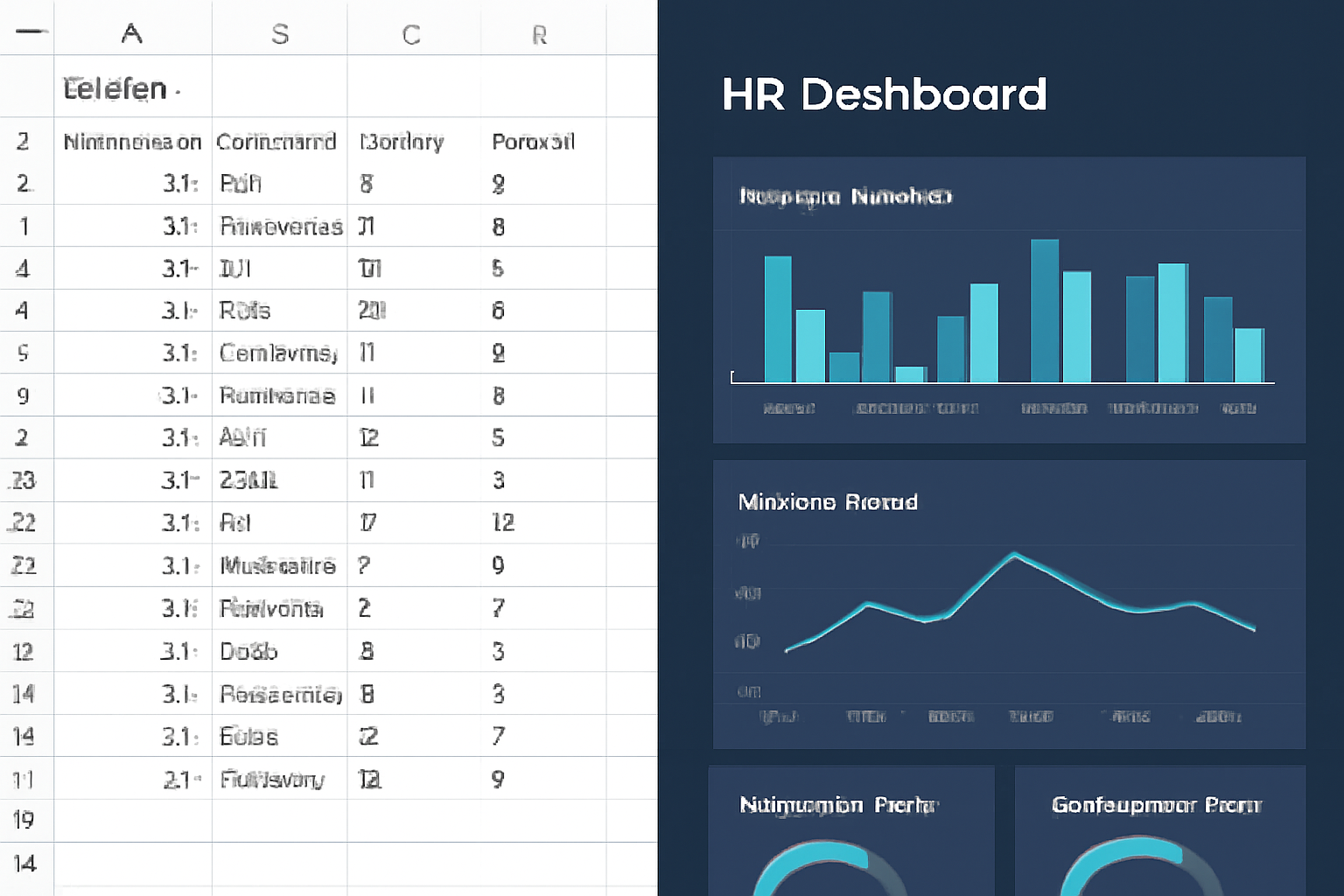
Choose appropriate visualization types for each metric. Line charts work best for trends over time, bar charts for comparisons across categories, pie charts for part-to-whole relationships (though use sparingly), gauge charts for metrics with target ranges, and heat maps for showing patterns across multiple dimensions. Avoid 3D charts and excessive decoration that obscure data.
Maintain visual consistency with a cohesive color scheme that aligns with your brand. Use color purposefully—green for positive metrics, red for concerns, and neutral colors for informational data. Ensure sufficient contrast for readability and accessibility.
Include contextual elements like comparison to targets, previous periods, or benchmarks. A metric without context has limited value. Show both current state and directional trends to support decision-making.
Step 6: Build and Test Your Dashboard
With planning complete, begin technical implementation. Connect your dashboard tool to data sources, either through direct connections, APIs, or data exports depending on your architecture. Build the necessary data transformations to calculate metrics correctly, handling common issues like employee status changes, organizational restructures, and data gaps.
Create each visualization according to your design specifications, starting with the highest-priority metrics. Implement filters and interactive elements that allow users to explore data by department, location, time period, or other relevant dimensions. Configure automated refresh schedules to keep data current without manual intervention.
Thoroughly test all calculations against known results from source systems. Verify that filters work correctly, dates display in the right format, and visualizations render properly on different devices and screen sizes. Have colleagues who weren’t involved in development test the dashboard with fresh eyes to identify usability issues.
Step 7: Implement Access Controls and Security
HR dashboards contain sensitive employee information requiring robust security measures. Implement role-based access controls that limit what data each user can see based on their position and legitimate business need. Executives might see organization-wide data, while managers see only their direct teams. HR business partners might access specific departments they support.
Apply data masking or aggregation for small groups where individual employees might be identifiable. Ensure your dashboard tool and data storage comply with relevant privacy regulations like GDPR, CCPA, or industry-specific requirements. Maintain audit logs of who accesses what data and when.
Document and communicate your data privacy policies clearly. Employees should understand what data is collected, how it’s used, and who can access it. Transparency builds trust in your analytics initiatives.
Step 8: Train Users and Drive Adoption
Even the most sophisticated dashboard provides no value if people don’t use it. Develop a change management plan that includes training sessions tailored to different user groups, quick reference guides and video tutorials, office hours where users can ask questions, and champions within each department who promote adoption.
Launch with a pilot group before rolling out organization-wide. Gather feedback and refine based on actual usage patterns. Celebrate early wins by sharing stories of decisions improved by dashboard insights.
Integrate dashboard review into regular business rhythms. Include key metrics in leadership meetings, monthly business reviews, and strategic planning sessions. When the dashboard becomes part of standard operating procedures, adoption becomes self-sustaining.
Step 9: Monitor, Iterate, and Improve
Dashboard development is never truly finished. Monitor usage analytics to understand which metrics stakeholders actually use and which are ignored. Conduct regular feedback sessions to identify gaps or new requirements. Business priorities evolve, and your dashboard should evolve with them.
Schedule quarterly reviews to assess whether metrics still align with strategic objectives. Remove metrics that don’t drive decisions and add new ones that address emerging needs. Refine visualizations based on user feedback and industry best practices.
Stay current with new features in your dashboard platform and emerging HR analytics trends. Continuous improvement ensures your dashboard remains a valued strategic asset rather than becoming stale and irrelevant.
Common Pitfalls to Avoid
Learn from others’ mistakes by avoiding these common dashboard failures. Don’t include too many metrics that overwhelm users and dilute focus. Resist the temptation to track everything measurable—focus on what’s actionable. Avoid vanity metrics that look impressive but don’t inform decisions.
Don’t neglect data quality in favor of flashy visualizations. Inaccurate data destroys trust faster than any design flaw. Ensure calculations are correct and transparent before worrying about aesthetics.
Don’t build in isolation without stakeholder input. Dashboards created without understanding user needs typically fail to gain adoption. Involve your audience throughout the development process.
Don’t set and forget your dashboard. Without regular updates and improvements, dashboards quickly become outdated and unused. Commit to ongoing maintenance and evolution.
Measuring Dashboard Success
Define success metrics for your dashboard initiative itself. Track user adoption rates, frequency of access, decisions influenced by dashboard insights, time saved compared to previous reporting methods, and stakeholder satisfaction scores. These measures help justify continued investment and identify improvement opportunities.
The ultimate measure of success is impact on business outcomes. Can you trace improved retention, faster hiring, better workforce planning, or other tangible benefits to insights gained from your dashboard? Document these wins to build support for expanding your analytics capabilities.
Building an HR analytics dashboard requires careful planning, technical execution, and ongoing refinement. By following this step-by-step approach, you’ll create a powerful tool that transforms how your organization understands and manages its most valuable asset—its people. Start with a focused scope, deliver value quickly, and expand based on demonstrated impact. Your dashboard will become an indispensable resource for data-driven people decisions that drive business performance.
Frequently Asked Questions
What metrics should I include in an HR analytics dashboard?
Essential HR dashboard metrics include headcount and workforce composition, turnover and retention rates, time-to-hire and cost-per-hire, employee engagement scores, absenteeism rates, and diversity metrics. Choose metrics that align with your organization’s strategic priorities and provide actionable insights for decision-makers.
What tools are best for building an HR analytics dashboard?
Popular tools for HR dashboards include Power BI, Tableau, and Looker for advanced analytics, Excel and Google Sheets for simpler dashboards, and specialized HR platforms like Visier, ChartHop, or One Model. The best choice depends on your technical capabilities, budget, data sources, and visualization needs.
How often should I update my HR analytics dashboard?
Most HR dashboards should refresh daily or weekly for operational metrics like headcount and attendance, monthly for recruiting and performance metrics, and quarterly for strategic metrics like engagement and succession planning. Real-time updates are ideal for critical metrics when technically feasible.
Do I need technical skills to build an HR analytics dashboard?
Basic dashboards can be built with minimal technical skills using tools like Excel or Google Sheets. However, more sophisticated dashboards with automated data integration and advanced visualizations benefit from skills in data modeling, SQL, and business intelligence tools, or collaboration with IT/analytics teams.
How do I ensure my HR dashboard data is accurate and secure?
Establish a single source of truth by integrating data from your HRIS, implement regular data quality audits, create clear data governance policies, and use role-based access controls to protect sensitive employee information. Regular validation against source systems and documented data definitions are also essential.